
The Immigrant Energy Paradox
They probably use less energy than you do. They almost certainly pay more for it.

Here’s a question that almost nobody in the energy world is asking: what happens to residential energy consumption patterns when 46 million people — about 14% of the U.S. population — come from somewhere else? (That’s the Census Bureau’s American Community Survey (ACS) count as of 2022; more recent Current Population Survey (CPS) estimates put the number closer to 51–53 million, driven by post-2021 arrivals that the ACS hasn’t yet captured.)
The energy burden literature has exploded in recent years — sophisticated on race, income, housing conditions, and geography. It is essentially silent on immigration status. Ramaswami et al. (2021) used fine-scale utility data for 200,000 households in St. Paul and Tallahassee and found energy use disparities by race (40–156%) and income (27–167%) far larger than previously estimated. Carley et al. (2022) documented in the Proceedings of the National Academy of Sciences how energy-insecure households resort to dangerous coping strategies — utility debt, burning trash, forgoing food — with deficient housing conditions as a leading predictor. Hernández et al. (2024), surveying 1,950 New York City residents, found nearly 30% experienced three or more indicators of energy insecurity, with significantly higher levels among renters, people of color, and recent immigrants. A Federal Reserve working paper found Hispanic households face significantly higher probability of being energy burdened, but didn’t disaggregate by nativity (FEDS 2025-026). The 2024 New York Fed/Enterprise Community Partners/Local Initiatives Support Corporation (LISC) compilation What’s Possible devotes entire chapters to equitable energy efficiency and home retrofit programs without once indexing on nativity. The earlier Brown et al. bibliometric review of 183 publications (2020) mapped gaps around landlords, multifamily housing, and race — but nativity never came up.
One study stands out as a direct precedent: Hernández et al. (2016) used ACS data to examine rent burden and energy insecurity concurrently among low-income families with children. Their key finding: immigrant households are more likely to experience rental burden but less likely to experience energy insecurity, and are “spared from the double burden” that falls hardest on native-born African Americans. The authors attributed this partly to housing type (immigrants cluster in more energy-efficient multifamily units) and partly to “home-country values, such as modest living and energy conservation practices.” That paper, published nearly a decade ago, is among the only rigorous U.S. studies to disaggregate energy hardship by nativity — and its findings align closely with the patterns that emerge from the data below.
At the macro level, a handful of studies connect immigration to energy and emissions. Squalli (2021) used U.S. state-level panel data and found that immigration may actually reduce per-capita emissions, likely through denser housing and lower consumption. Dedeoglu et al. (2021) found immigration increases aggregate U.S. CO₂ emissions, but through the population-growth channel, not household behavior. What’s missing between these macro studies and the granular equity literature is the view from inside the home: how do immigrant households actually experience the energy system — what do they live in, what do they pay, what do they consume per person? The Energy Information Administration’s (EIA) Residential Energy Consumption Survey (RECS), the gold standard for residential energy data, doesn’t code for country of birth. The analysis below is a cross-dataset attempt to start filling that gap.
The approach: overlay census tract-level nativity data from the American Community Survey with the Department of Energy’s (DOE) Low-Income Energy Affordability Data (LEAD) Tool energy burden estimates across 12 counties and 7 climate zones — from Miami-Dade to Minneapolis. The patterns that emerged are striking.
Why these 12? The counties were chosen to maximize variation along three dimensions: climate (from cooling-dominated Miami to heating-dominated Minneapolis), immigrant share (from Hennepin County at ~15% foreign-born to Miami-Dade at ~54%), and origin-country mix (Latin America-dominant, Asia-dominant, and mixed). Each county had to be large enough to contain census tracts across the full spectrum of immigrant concentration — low, medium, and high — so that comparisons happen within the same housing market, labor market, and utility territory. The goal wasn’t a nationally representative sample; it was a diverse enough set to see whether the same structural patterns hold across very different contexts. They do.
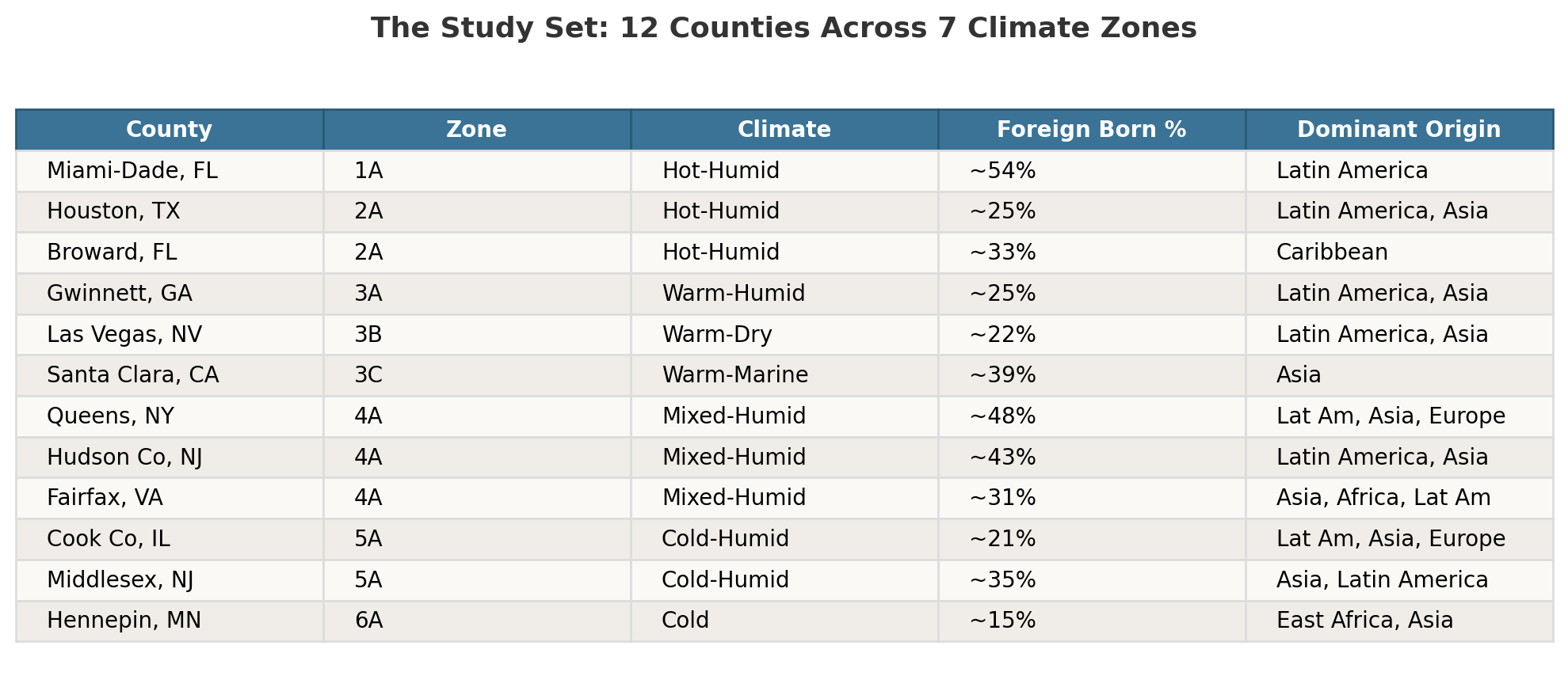
In each county, census tracts are classified into three tiers by immigrant concentration: Low (<10% foreign-born), Medium (10–30%), and High (>30%). Then everything gets compared — housing type, tenure, income, household size, energy burden. A caveat upfront: the ACS likely undercounts the foreign-born population, particularly undocumented immigrants. Research by Warren (2022) in the Journal on Migration and Human Security found Central American noncitizens had ACS undercount rates of 15–25%. The Migration Policy Institute notes that the ACS misses some immigrants during the survey process. This analysis, like any built on ACS data, should be read as a lower bound.
The Pattern Is Real
Before getting into the energy implications, here’s the basic structural pattern. It shows up in every county in the sample, regardless of climate zone or dominant immigrant origin.
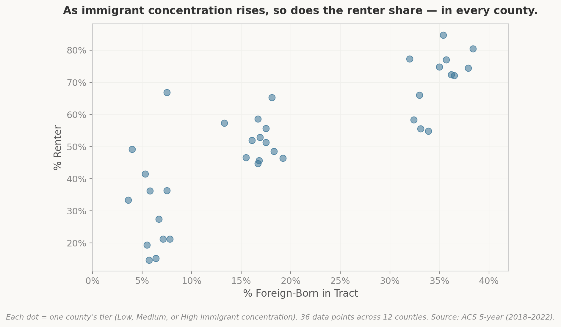
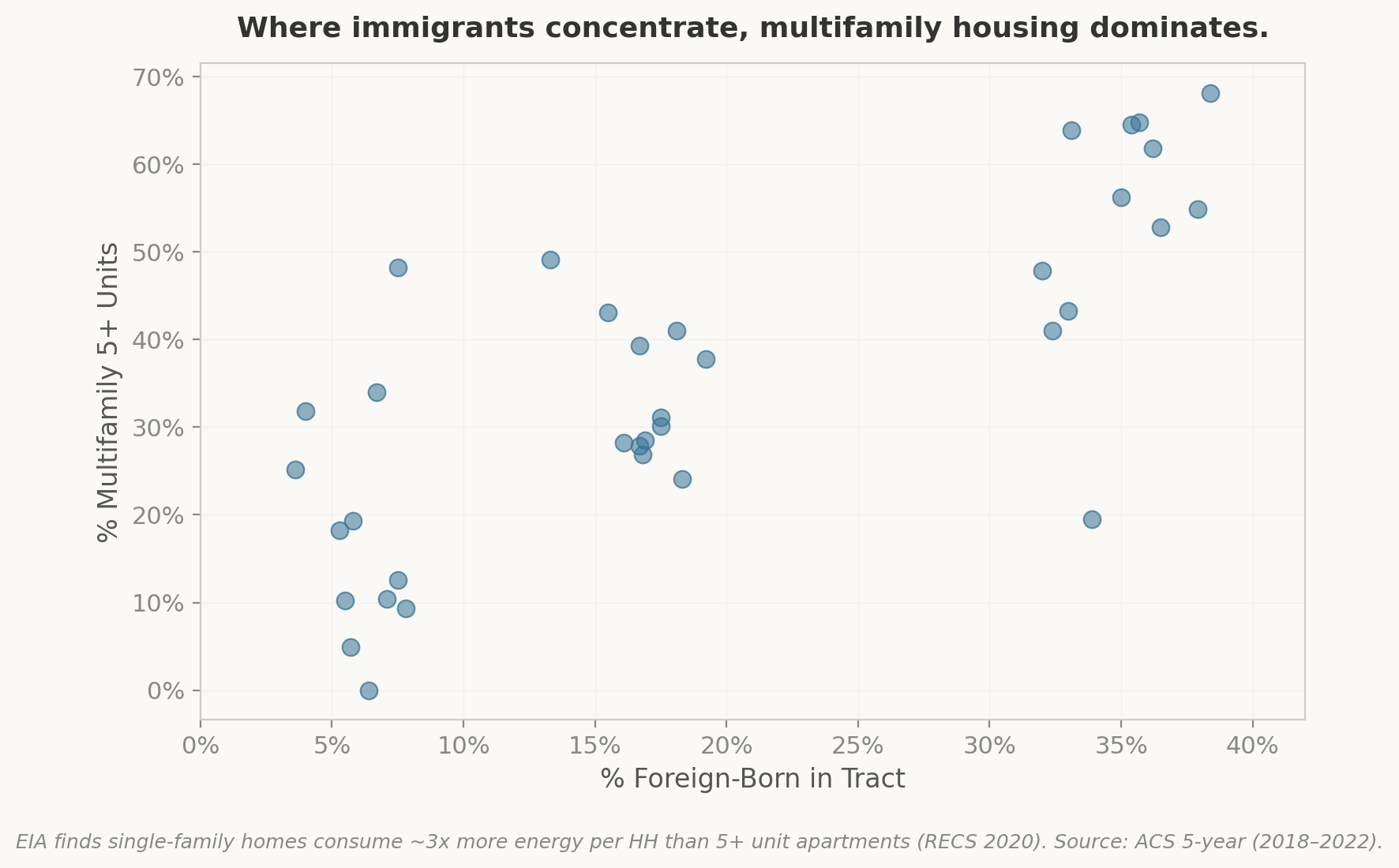
Those clouds might look abstract with 36 dots. Here’s what the pattern looks like inside a single county — Harris County (Houston), which has tracts ranging from under 6% to over 35% foreign-born:
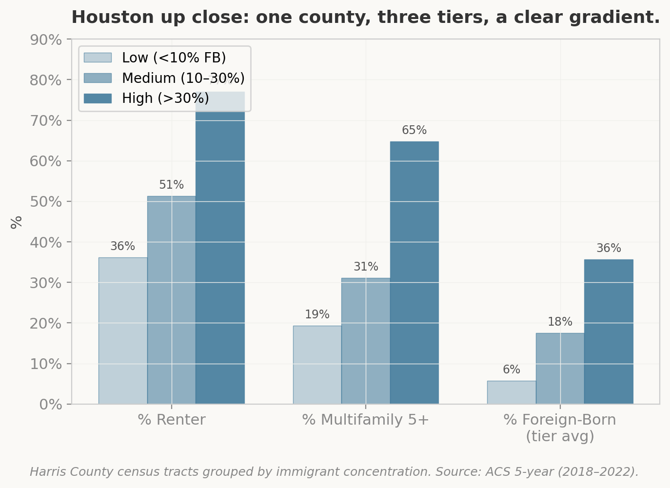
These aren’t subtle patterns. The Houston spotlight makes it visible: low-immigrant tracts are 72% single-family with 36% renters. High-immigrant tracts flip entirely — 77% renter, two-thirds in buildings of five or more units. The pre-1980 housing share jumps from 37% to 56%. And this same structural gradient shows up in every county in the sample.
The Housing Fingerprint
This consistent structural shift — more renters, more multifamily, older stock — is the key to the energy story. Building type is a major driver of household energy consumption. According to the EIA, the average single-family detached home uses nearly three times more energy than a household in a building with five or more apartments (EIA, “Use of Energy in Homes”). Shared walls, less exposed surface area, and smaller units all reduce per-household consumption.
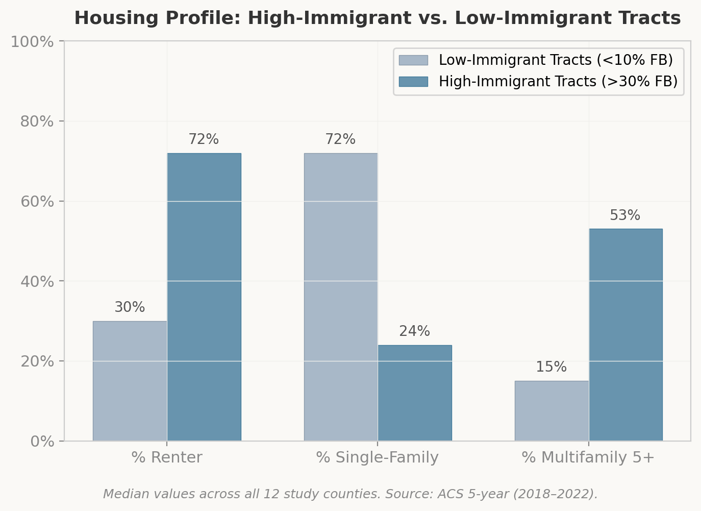
But here’s the catch: older multifamily stock — especially pre-1980 — tends to have poor insulation, outdated heating and cooling systems, and the classic landlord-tenant split-incentive problem. The person paying the utility bill isn’t the person who’d invest in efficiency upgrades. Immigrant-dense tracts are disproportionately stuck in exactly this position: housing that should use less energy by design, but does use more than it needs to because of deferred maintenance and misaligned incentives.
The Per-Capita Twist
Here’s where it gets interesting. Most energy analysis is done at the household level — cost per household, consumption per household. But immigrant households are bigger. Across the study areas, high-immigrant tracts average 2.7–3.1 people per household versus 2.2–2.9 in low-immigrant tracts. In heating-dominated climates (Zones 5A and 6A), the ratio is 1.1x to 1.2x.
Even if household-level energy costs are identical, per-capita energy consumption in immigrant-dense tracts would be 10–20% lower simply because more people share the same dwelling.
This is the paradox: the household might be paying $1,800 a year for energy — the same as its native-born neighbor — but splitting that cost across 3.1 people instead of 2.4. Per person, that’s less energy consumed. But as a share of per-capita income? It’s a much bigger bite.
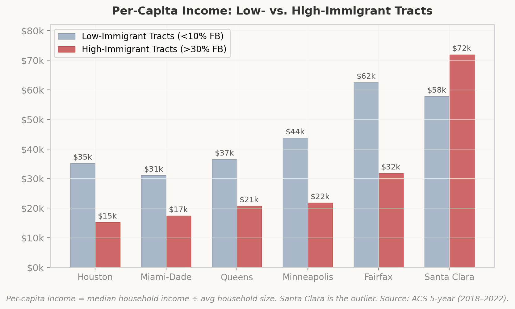
Houston is the most extreme case. Per-capita income in high-immigrant tracts is $15,230 — 43 cents for every dollar in low-immigrant tracts. Even in Minneapolis, where the foreign-born share is relatively small, the high-immigrant tracts (largely East African and Asian) show per-capita income at half the level of low-immigrant tracts.
And then there’s Santa Clara County — the outlier that proves the rule about treating “immigrant” as a single category. In Silicon Valley, high-immigrant tracts have higher per-capita income than low-immigrant tracts: roughly $71,900 versus $57,800. The reason is composition: Santa Clara’s foreign-born population is predominantly Asian (Indian, Chinese, Vietnamese), disproportionately in high-skill tech employment, with household incomes well above the county median. The housing pattern still holds — more renting, more multifamily — but the income story runs in the opposite direction. “Immigrant-dense tract” means one thing in Houston’s Gulfton neighborhood and something entirely different in Cupertino. Any analysis or policy that flattens those into a single category will get both wrong.
Climate Zone Matters
Why 12 counties across 7 climate zones? Because climate is the single biggest driver of residential energy consumption, and it interacts differently with immigrant housing patterns depending on whether you’re heating or cooling.
But there’s an even simpler point the data make: most immigrants are concentrated in places where cooling — not heating — is the dominant energy load. Nationally, the top foreign-born states are California, Florida, Texas, New York, and New Jersey. In this sample, the pattern is the same:
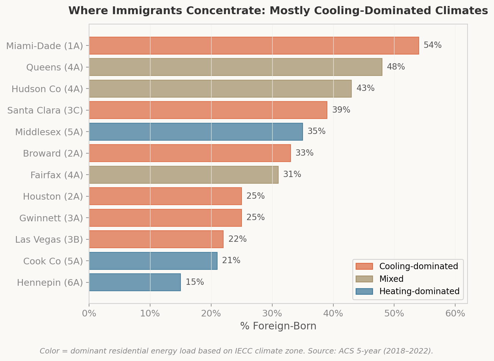
This matters for policy. Weatherization programs were designed around heating — insulation, furnace efficiency, air sealing to keep warmth in. But the counties with the largest immigrant populations need cooling solutions: efficient air conditioning, window treatments, reflective roofing, and ventilation in older multifamily buildings that were never designed for the AC loads they now carry.
In cold, heating-dominated climates (Zones 5A and 6A), immigrant-dense tracts do consistently have larger households — 1.1x to 1.2x the size of low-immigrant households in the same county. Minnesota’s heating bills are the highest in the sample (98 million BTU per household per year, per the RECS data). Spreading that cost across a larger household is a meaningful per-capita reduction. But the flip side: those households are in older multifamily buildings with 75% pre-1980 stock, paying heating bills they can’t control because the landlord has no incentive to insulate.
So What?
This analysis is ecological — tract-level patterns, not individual household data. It’s built on modeled energy estimates, not metered consumption. There are confounders everywhere. All the usual caveats apply.
But the directional findings are clear enough to be useful, and they point to a few things that matter for policy:
Weatherization programs are missing a population. The federal Weatherization Assistance Program has historically allocated funding through a formula that heavily favors cold-climate states — a bias Kaiser (2003) documented in Energy Policy and that CRS confirms remains structurally unchanged thirty years later. As the climate zone chart above shows, the counties with the largest immigrant populations are overwhelmingly in cooling-dominated climates — precisely the places the formula shortchanges. High-immigrant tracts in those counties have disproportionately old housing stock and high renter shares — exactly the combination that benefits most from weatherization. And the evidence suggests these communities are indeed underserved. The American Council for an Energy-Efficient Economy (ACEEE) explicitly identifies “recently arrived immigrants” and “those with limited English proficiency” among groups historically underserved by energy efficiency programs. A separate ACEEE study of California’s largest efficiency programs found they communicated nearly all program information in English — despite nearly 40% of state residents speaking a primary language other than English. The federal Weatherization Assistance Program has no immigration-specific outreach mandate; eligibility is income-based, but awareness and access are not.
Per-household metrics hide what’s actually happening. When a household of 3.1 people spends the same on energy as a household of 2.4, those aren’t equivalent outcomes. Energy efficiency programs that target “high-cost households” may systematically miss high-burden households that happen to have lower absolute costs because they’re packed into smaller units.
“Immigrant” is not monolithic — and policy shouldn’t be either. As the Santa Clara contrast shows, origin-country composition drives radically different income, housing, and energy profiles within the same “high-immigrant” label. Outreach, eligibility design, and language access all need to be calibrated to the actual communities in question, not to a demographic abstraction.
The data infrastructure doesn’t exist. RECS doesn’t code for nativity. LEAD is modeled. There is no national dataset that connects actual metered energy consumption to immigration status at the household level. Building that capacity — even through targeted survey supplements — would let us move from “directionally interesting” to “actionable.”
This analysis hasn’t even touched transportation yet. It covers residential energy only. DOE’s State and Local Planning for Energy (SLOPE) platform and the National Household Travel Survey offer data on transportation energy burden by census tract — commute distances, vehicle ownership, transit access — all of which vary dramatically by immigration status and geography. That’s the next piece of this puzzle.
Acculturation is the missing variable. Do energy consumption patterns change across immigrant generations? First-generation households may conserve energy out of habit or necessity; by the second generation, consumption may converge toward native-born norms. The Panel Study of Income Dynamics (PSID) longitudinal structure could support this analysis, but no one has done it for energy. Another future post.
Forty-six million people. Fourteen percent of the population. Concentrated in specific housing types, in specific climate zones, with specific income profiles and specific landlord-tenant dynamics. The energy system interacts with all of that — but nobody’s really looking. If you’re working in this space — weatherization, utility assistance, housing policy, energy equity — I’d love to compare notes.
Methodology: Cross-dataset analysis overlaying ACS 5-year (2018–2022) census tract nativity data with DOE LEAD Tool (2022 update) energy burden estimates and EIA RECS 2020 state-level benchmarks. 12 counties across International Energy Conservation Code (IECC) climate zones 1A through 6A. Tracts classified by immigrant concentration: Low (<10% foreign-born), Medium (10–30%), High (>30%). Tracts with <500 population excluded. Full methodology and replication code available upon request.
Data sources: U.S. Census Bureau ACS via Census API (ACSBR-019); DOE LEAD Tool via data.openei.org; EIA RECS 2020 State-Level Tables; EIA, “Use of Energy in Homes”; Brown et al. (2020), “Energy burden research in the United States,” Energy Research & Social Science; Federal Reserve (2025), “Energy Consumption and Inequality,” FEDS 2025-026; Warren (2022), “Use with Caution,” Journal on Migration and Human Security; ACEEE, Energy Equity and Leading Programs (2023); Ramaswami et al. (2021), “Measuring social equity in urban energy use,” PNAS; Carley et al. (2022), “Behavioral and financial coping strategies,” PNAS; Hernández et al. (2024), “Energy Insecurity Indicators,” Health Affairs; Hernández et al. (2016), “Housing hardship and energy insecurity,” J Child Poverty; Squalli (2021), “Disentangling immigration and emissions,” Population and Environment; Dedeoglu et al. (2021), “Immigration and CO₂ emissions,” Air Quality, Atmosphere & Health; NY Fed/Enterprise/LISC (2024), What’s Possible; Kaiser (2003), “The WAP Funding Formula,” Energy Policy; Congressional Research Service (2025), “The Weatherization Assistance Program Formula” (R46418).